

The state of Maskachusetts keeps very detailed records of the death toll from the virus. And they’re all public.
For instance, on page 11 of what is called the daily coronavirus dashboard, the state Department of Public Health (DPH) reports that between July 26 and Aug. 8, 160 Massachusetts residents died of the virus.
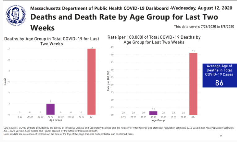
But on page 37 of the weekly report, the DPH reports that only 14 Massachusetts residents died in that same fortnight.
So which is it – 160 or 14?
On the afternoon of Aug. 6, the DPH recorded that the virus had killed another 32 MA citizens — which made for big headlines that evening in the credulous, brain-dead Boston media.
Now, however, the DPH reports only 12 people died that day.
Which is it — 32 or 12?
On one page the DPH reports that the average age of decedents in this state is 82. On another page, the average age is listed as 86.
Which is it — 82 or 86?
None of this makes any sense, unless you’re creating “statistics” to try to keep the hysteria going — to continue the lockdowns, crush the economy, keep the schools closed, etc.
If that’s the strategy, it’s certainly working, considering that Gov. Charlie Parker now boasts the highest unemployment rate in the nation — 17.4%.
I asked the state to explain all these contradictory numbers that are, in fact, “hot garbage,” as one of my readers put it.
I got back a response “on background.” That means it’s not their official response, and normally I wouldn’t quote “background” directly. But it’s hard to paraphrase something that I cannot decipher (and neither, I suspect, can they):
“The death numbers on an individual day in the daily dashboard represent the deaths reported to DPH on that day. The weekly dashboard looks at cases that have been diagnosed during a two-week time period and the deaths that are reported in the weekly report are associated with those cases. I hope this helps.”
It does, but only in the sense that it proves how little about this panic is on the level.
Let’s return to Aug. 6. This was right about the time that the dithering fool who is governor was wringing his hands about the “slight upward uptick.” Again, the original number of deaths reported that afternoon, to great media fanfare, was 32.
Now on the daily chart the number of dead on Aug. 6 is listed as 14.
But since the weekly dashboard now gives the entire July 26-Aug.8 death total as 14, it appears the real number for Aug. 6 was closer to … one. One death.
And so, on the basis of fraudulent data, we now endure another tightening of the screws — more idiotic restaurant policing, outdoor gatherings cut from 100 to 50, more Karens emboldened to rat out their neighbors on the governor’s odious snitch lines and so forth.
I know, what can you expect from the DPH? This is the same state agency that falsified at least 38,000 drug tests in criminal cases, wrongfully sending thousands of people to prison.
But now we’re supposed to accept the DPH’s analysis as gospel, because they’re as ethical and trustworthy as, say, the RMV or the State Police.
I got interested in the DPH’s phony numbers last week, when they abruptly removed the most revealing chart on their daily dashboard, “Deaths and Death Rate by Age Group.”
By itself, that one chart put the lie to Charlie Parker’s daily doses of panic porn. On the last day it appeared, the DPH listed the number of deaths of MA residents under the age of 20 as zero.
I repeat, zero deaths from the virus in Massachusetts among those under the age of 20. Massachusetts deaths between the ages of 20 and 29: 17.
Between the ages of 30 and 39: 35 deaths.
In all, of the state’s 8,582 deaths as of Friday, exactly 146 have been of people under the age of 50.
That chart was closely monitored by those of us who are, shall we say, skeptical, of the Fake News-Big Government narrative. I used to tweet the chart out almost every day.
But now it’s gone, although the DPH says it was just “streamlining,” and that a variation can now be viewed on the weekly chart. But the new chart, in addition to being buried (on page 35), is not nearly as revealing, and it only comes out once a week. How convenient for the purveyors of panic porn.
Still, even the truncated new chart proves the idiocy of the shutdown — of the 14 deaths on the new chart, 12 were of people over the age of 80. And during those two weeks, there were no deaths — none — of anyone under 40, or between the ages of 50 and 79.
Those are the DPH’s own numbers.
I’m going to keep tweeting out the charts every weekday. But maybe I’ll concentrate even more on nursing homes — you know, the facilities whose operators gave Tall Deval more than $52,000, and in an odd coincidence 5,585 of the state’s 8,529 deaths have occurred there.
From Wednesday to Friday, the state recorded another 53 deaths, 51 of which occurred in Gov. Charlie Parker’s death houses. It’s all right there on page 15. The chart is labeled “COVID-19 Cases in Long-Term Care Facilities.”
Check it out quickly, though. Those numbers are so devastating that I suspect that’s the next chart Tall Deval will “streamline” into oblivion.
I hope this helps.